 All Work
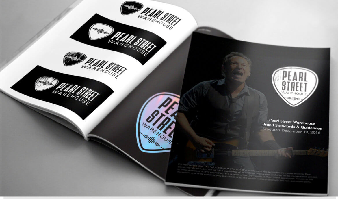
Logo Design & Brand Identity
Logo Design & Brand Identity
The Brief
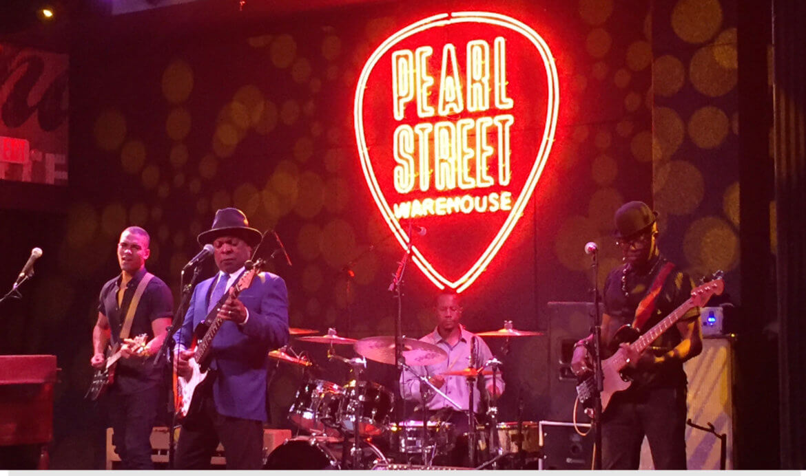
Pearl Street Warehouse puts audiences within 25 feet of the stage every night of the week.
They needed a brand that matched the energy of the room.
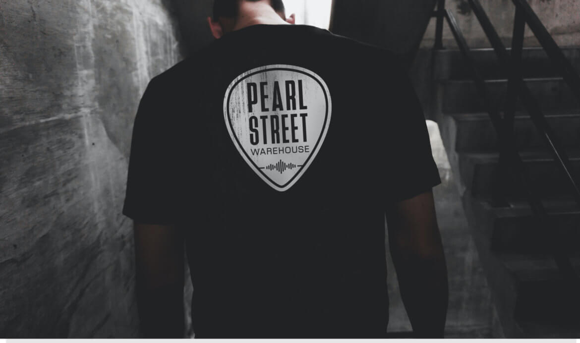
We built one: a guitar pick mark and a visual identity system that is one part Austin, one part Nashville, and 100% D.C.
The Challenge
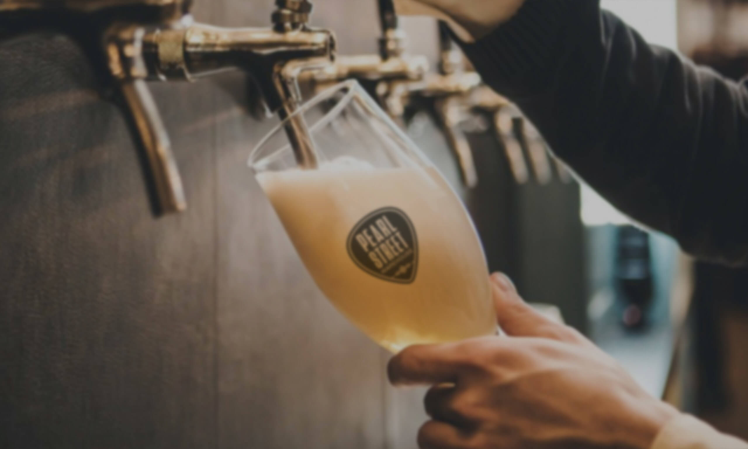
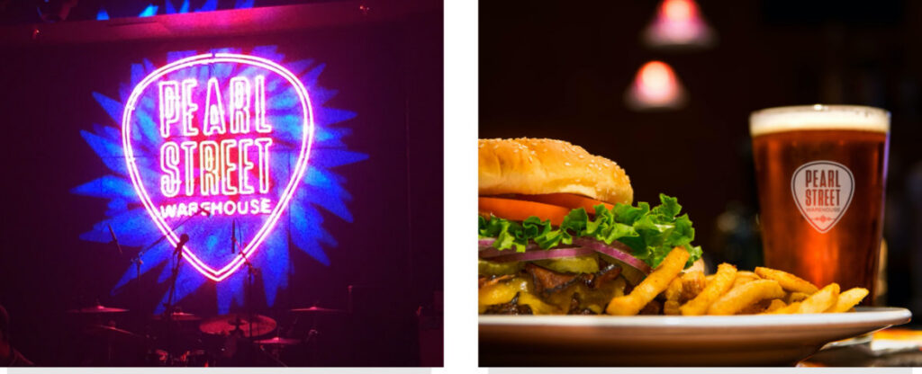
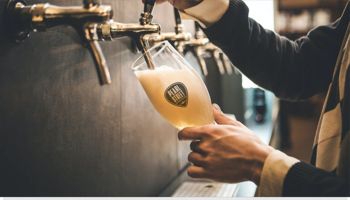
Pearl Street Warehouse needed a brand that could carry the weight of what happens inside it every night: live music from artists who define American roots genres, performed in an intimate room where no one sits more than 25 feet from the stage. The challenge was translating that physical closeness, that electric quality of a great live music room, into a visual system that could live on a ticket stub, a draft pint, a marquee, and a social post.
Our Approach
BrandLinkDC brought Sutter Group in to build the mark from the ground up. We started with the instrument itself and found the answer in the guitar pick: a shape that is immediately legible, rooted in music, and simple enough to work at any scale. The pick became the primary logo form, balancing the warmth of Austin and Nashville with the edge of a Washington waterfront venue. Color, typography, and collateral followed from that center, giving Pearl Street a complete identity as memorable as the music it presents.
Pearl Street Warehouse delivers something rare in Washington: intimate live music where no seat is more than 25 feet from the stage. Rock, country, blues, roots, and bluegrass from artists who define those genres. BrandLinkDC brought Sutter Group in to build a visual identity worthy of the experience. The brief called for something that could hold its own in Austin and Nashville while being unmistakably D.C. The answer was a guitar pick: simple, elegant, and just a little funky. The mark carries the dual energy of American roots music traditions while grounding the brand in Washington's waterfront character. The full identity system, spanning color, typography, and collateral, gives Pearl Street a presence as memorable as the music itself.


Color Palette
#A8C8E8
Light Blue (PMS 651C)
#2878B4
Medium Blue (PMS 3015C)
#003865
Dark Blue (PMS 295C)
#AC2B37
Red (PMS 200C)
#EDE3C8
Light Yellow (PMS 7499C)
Typefaces
Display / Headlines
Knockout
Aa Bb Cc Dd Ee Ff Gg Hh Ii Jj
0 1 2 3 4 5 6 7 8 9
Body / Collateral
Trade Gothic
Aa Bb Cc Dd Ee Ff Gg Hh Ii Jj
0 1 2 3 4 5 6 7 8 9