 All Work
Brand Identity & Design System
Brand Identity & Design System
The Brief
A broadcast data company with the technology, no name, and no brand.
Three name candidates. Three logo concepts. One clear decision.
We built the identity that made the choice for them.
The Challenge
BitPath needed to establish credibility and energy simultaneously in a category - broadcast spectrum infrastructure - with no consumer-facing analog. Enterprise buyers in public safety, GPS, and media had to immediately understand what the company did and trust that it was built to last, without a prior brand reference point of any kind. And the project started before the company even had a confirmed name.
Our Approach
Running naming and identity in parallel let design make the decision. A logo concept for each name candidate gave the choice a visual dimension it could not have had through word evaluation alone. The winning mark - signal arcs forming a B - made the brand direction self-evident. From there we built a system designed to prove itself across every context the brand would encounter: office environments, branded collateral, digital surfaces, and dark-background applications.
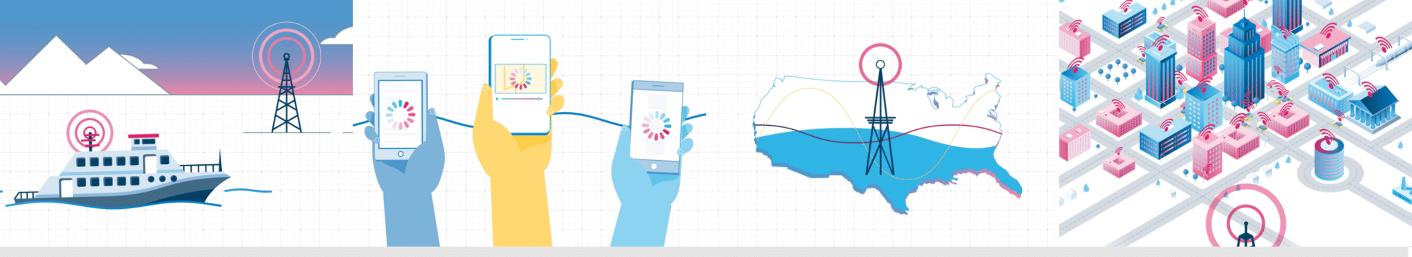
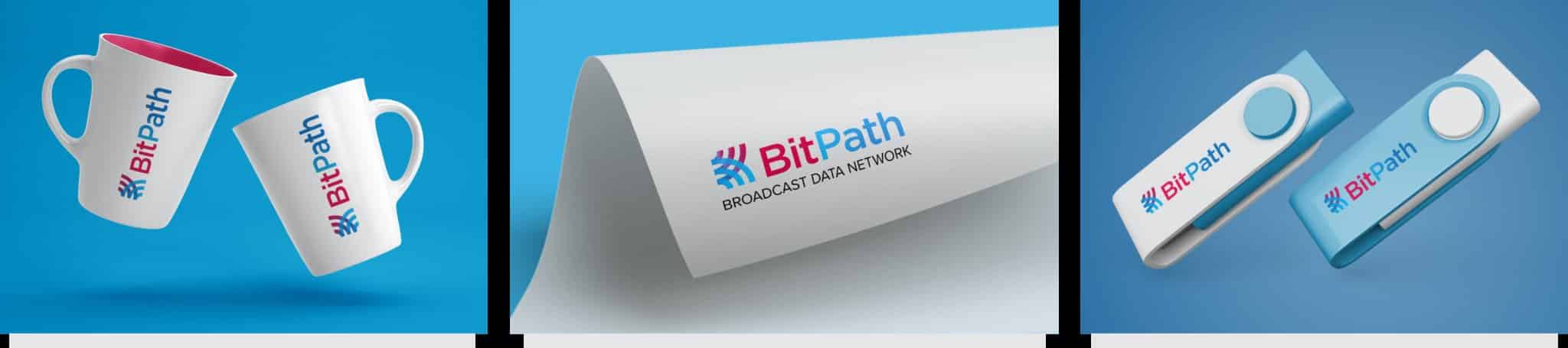
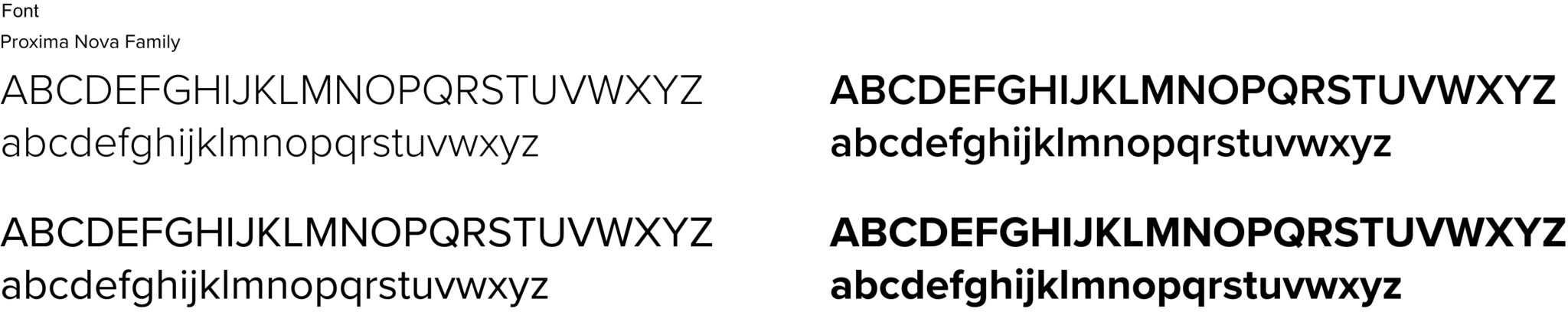
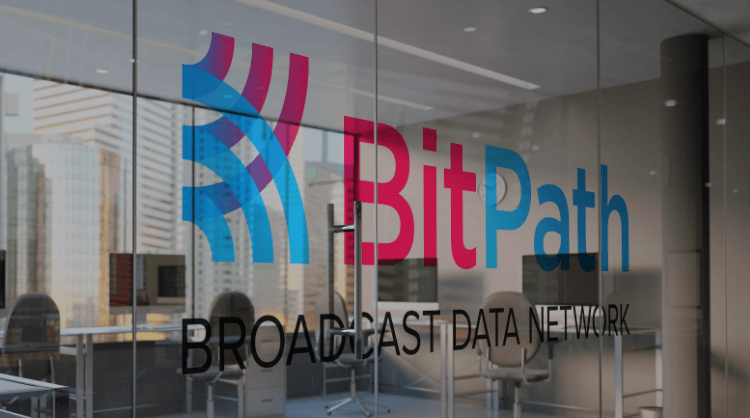
BitPath arrived before their brand existed - or their name was settled. The technology was real: a broadcast data network that captures unused broadband spectrum from television transmission and routes it to organizations that need extra bandwidth. Fire departments managing emergency coordination across multiple agencies. GPS networks filling gaps between satellite updates. Sports broadcasters handling live feed distribution during peak demand. The infrastructure was operational. What the company lacked was an identity that could make the technology legible and compelling to institutional buyers. The engagement began at naming. BitPath came in with three candidate names and no conviction about which to commit to. Rather than evaluate the options in the abstract, we designed a distinct logo for each name. That process changed the nature of the decision: when the client saw what "BitPath" looked like as a mark, the other candidates were effectively settled. The logo does conceptual work. The mark reads as a stylized B constructed from broadcast signal arcs - two interlocking curves that reference radio wave transmission while forming a recognizable letterform. The dual-color split between crimson and sky blue runs through both the icon and the wordmark, giving the brand a visual energy the broadcast infrastructure category rarely achieves. A third tone, deep blue, grounds the system and expands its range across dark backgrounds, light surfaces, and environmental applications. From the logo outward, we built a complete brand system. Color values were specified with full primary and gradient documentation. Proxima Nova was selected as the brand typeface for its geometric clarity and performance across the full weight range. Brand guidelines covered usage rules, clear space requirements, background treatments, and prohibited applications. Collateral mockups - branded mugs, USB drives, letterhead - tested the identity against physical surfaces before the guidelines were finalized and delivered.
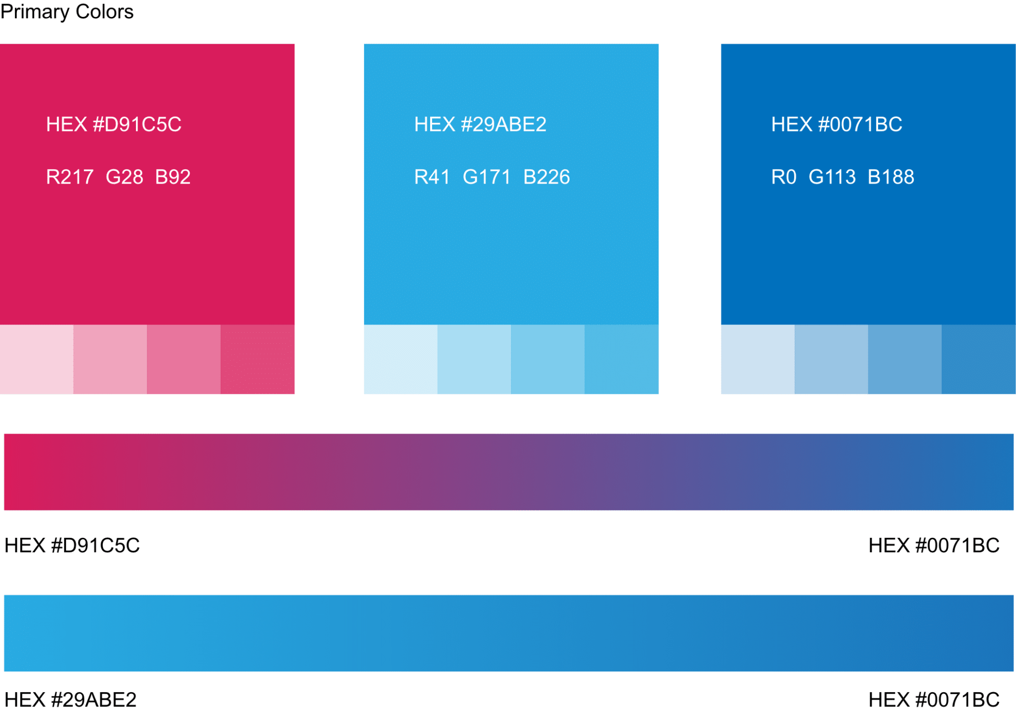


Color Palette
#D91C5C
Crimson
#29ABE2
Sky Blue
#0071BC
Deep Blue
Typefaces
Geometric sans-serif chosen for technical precision and performance across the full weight range
Proxima Nova
Aa Bb Cc Dd Ee Ff Gg Hh Ii Jj
0 1 2 3 4 5 6 7 8 9