 All Work
Brand Identity & Logo Design
Brand Identity & Logo Design
The Brief
Make it read American anywhere in the world, without a single word of English.
The Challenge
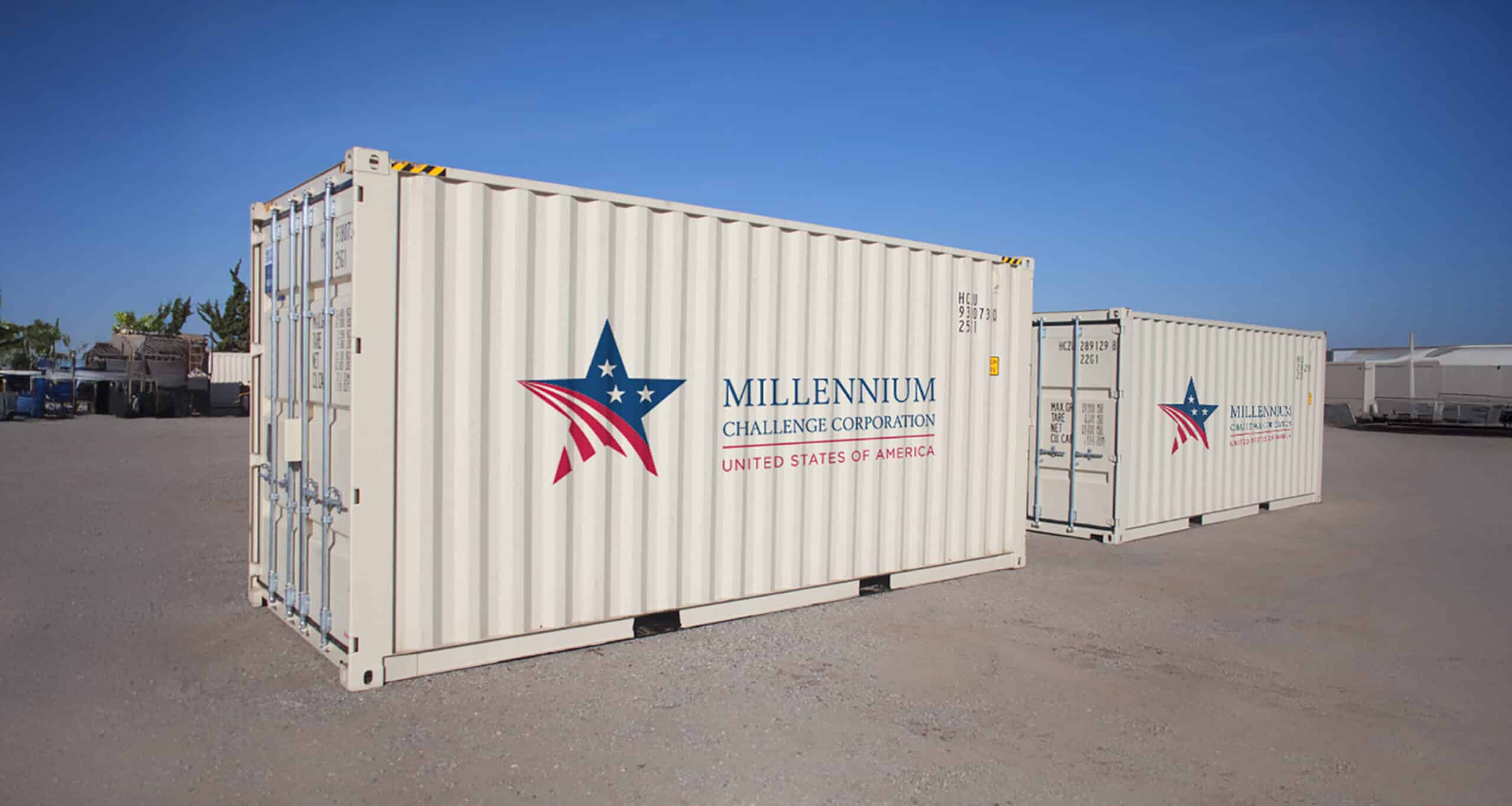
MCC needed a mark that could stand alone anywhere in the world, communicating American origin without language. The requirements were specific: a red, white, and blue palette; stars and stripes; and an identity clearly distinct from the U.S. flag. The challenge was equal parts symbolic and practical. The mark would appear on shipping crates, vehicles, hard hats, and warehouses in countries where English is rarely spoken, and had to be instantly recognizable by people who might never read the name attached to it.
Our Approach
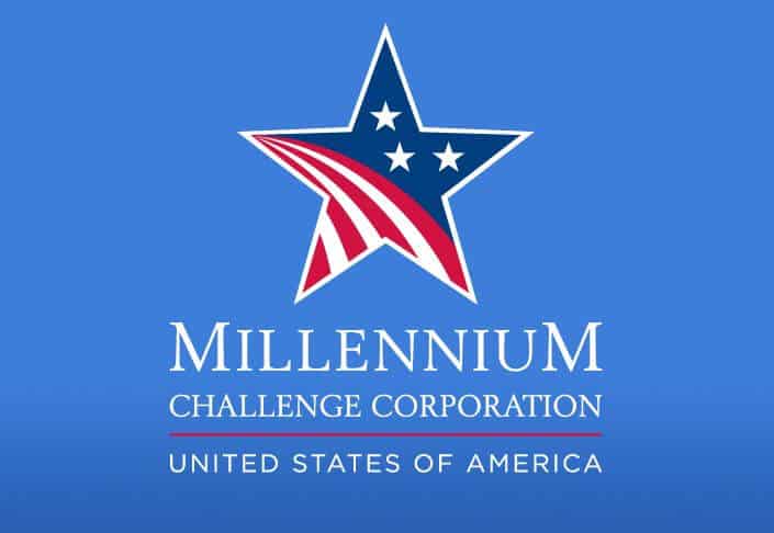
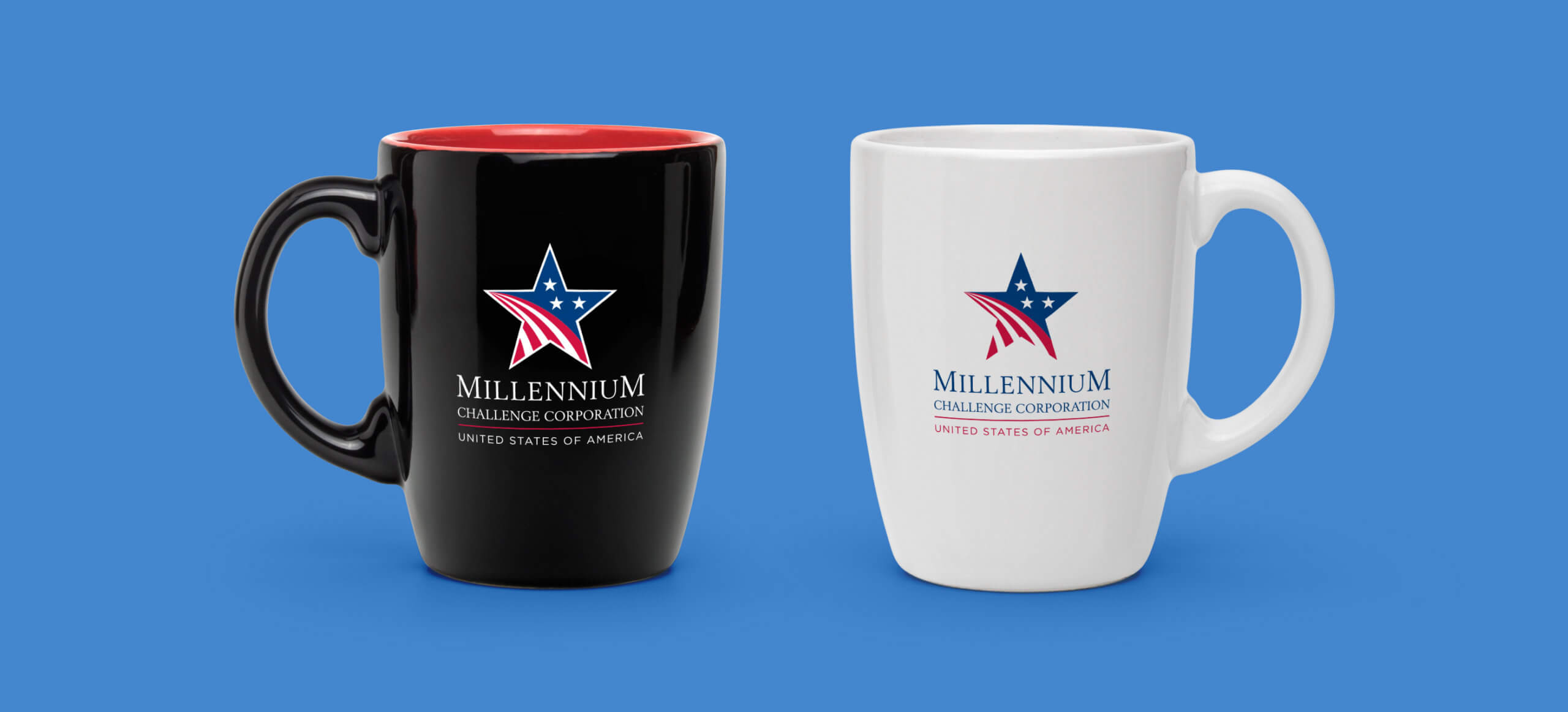
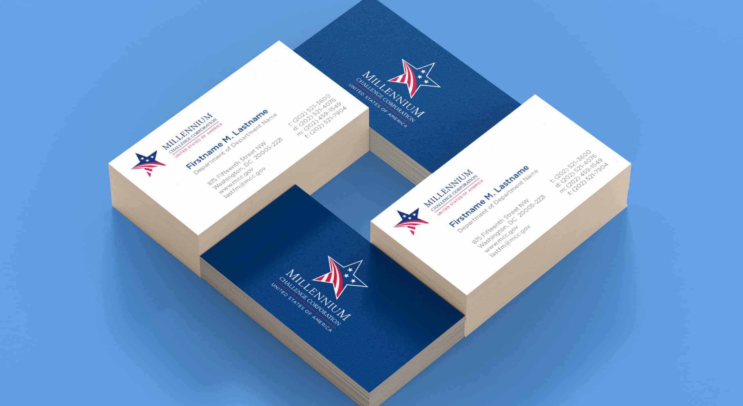
Sutter Group took a reductive approach, designing a mark built entirely around meaning. A blue field holds three stars, each representing one of the criteria countries must meet to qualify for MCC grants: good governance, economic freedom, and investment in citizens. Red and white stripes form the base of the icon, evoking roads and plowed fields, a direct reference to the two categories of projects MCC funds: transportation and agriculture. The result communicates American identity through symbol alone, without borrowing a single element of the flag directly. The mark was delivered in horizontal and vertical configurations, paired with the tagline "Reducing Poverty Through Growth," and scales equally well from a letterhead to the side of a truck.
Millennium Challenge Corporation is a U.S. government agency that provides development grants to qualifying nations. Their identity needed to work everywhere they operate: shipping containers, field vehicles, hard hats, and warehouse signage across the developing world.

Color Palette
#002868
Navy
#BF0A30
Red
#FFFFFF
White
The Outcome
qualifying criteria encoded in the mark
logo configurations for any surface, any scale