 All Work
Brand Identity
Brand Identity
The Brief
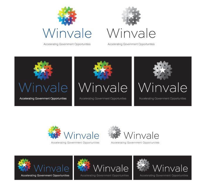
The mark signifies the energy of the company and the confluence of services that come together to form one integrated end product.
The Challenge
Winvale sold something hard to make tangible, help navigating federal procurement. They were competing against better known firms in a market that had grown more crowded, and the identity they had carried neither the energy of the company nor the breadth of what it actually did.
Our Approach
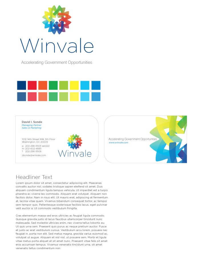
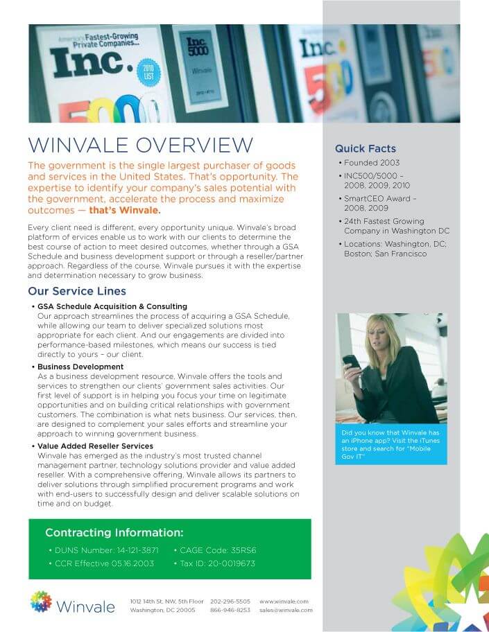
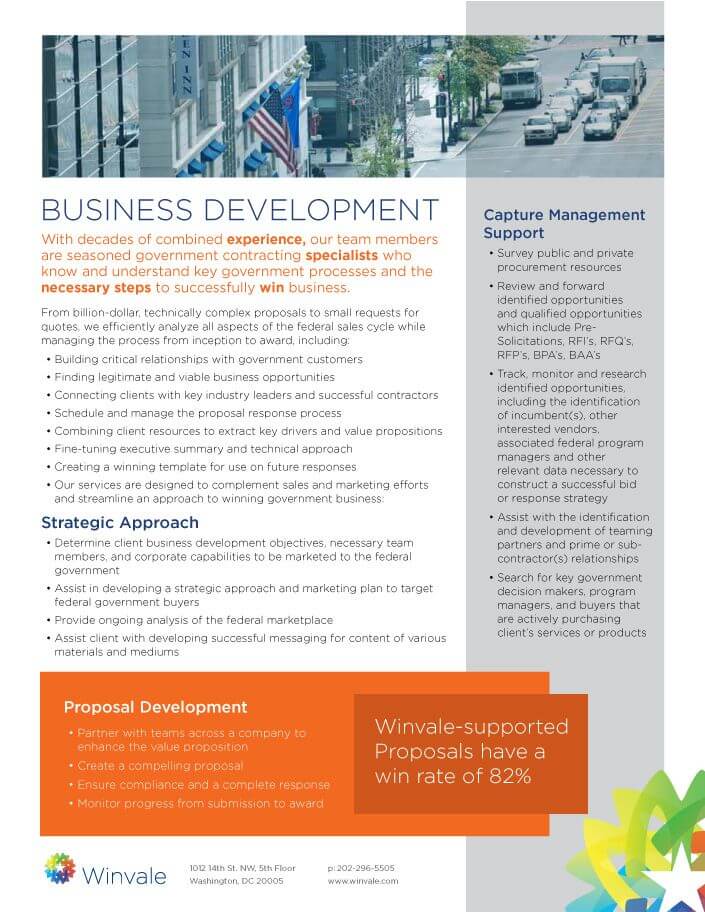
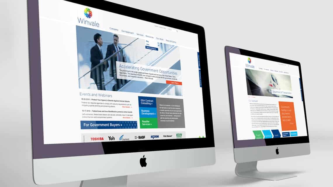
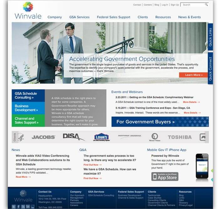
We started with research rather than sketches. Primary and secondary research into how Winvale was perceived, and how competitors positioned themselves, produced a statement built on two things the firm genuinely had, a young and energetic culture and a full service approach where the parts worked together. The mark came out of that statement. Overlapping forms converge on a single point, which reads as energy and as separate services resolving into one result. The identity then carried into stationery, sell sheets, business development collateral, video testimonials and a website organized from a content map built on analytics and conversations with Winvale's own customers and sales team. That site has since been replaced, which is normal for its age. The identity has not been. We do the same work for firms selling into the federal market through GovCon creative services and capabilities statement design.
Winvale is a Washington DC consultancy that helps companies get onto the GSA Schedule and sell to the federal government. They came to Sutter Group needing to connect with prospects in a market that had become harder to stand out in. We ran primary and secondary research, built a positioning statement around the firm's energy and its integrated approach, and designed the identity that came out of it. More than fifteen years later that mark is still the logo on their website. For how we approach this work with federal contractors, see our GovCon brand strategy page.