 All Work
Brand Identity
Brand Identity
The Brief
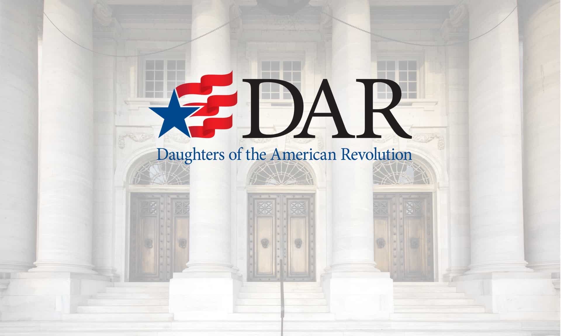
The new logo reinforces DAR as a relevant, vibrant organization, while still allowing the DAR to be easily identified.
The Challenge
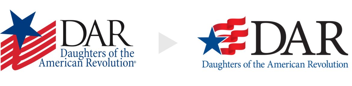
DAR had no formal branding. Their clip art flag logo had spread unevenly across thousands of state, local, and international chapters, each of which had customized it differently over the years. Inconsistent colors, proportions, and variations had multiplied across the organization, and multiple in-house divisions had created their own marks entirely. The result was a fragmented visual identity with no shared brand language to unify the membership.
Our Approach
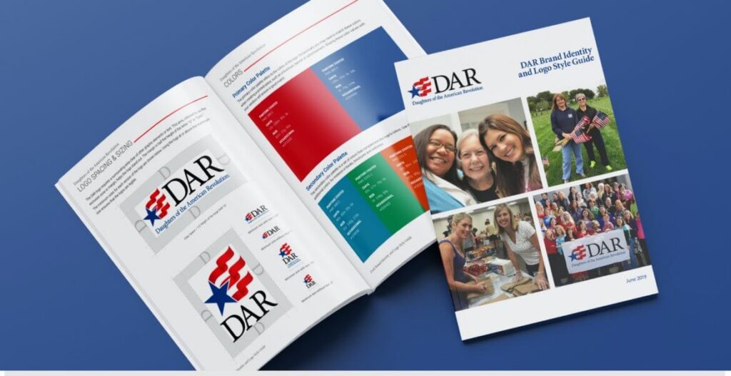
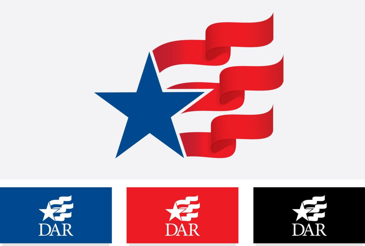
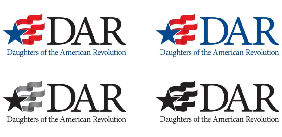
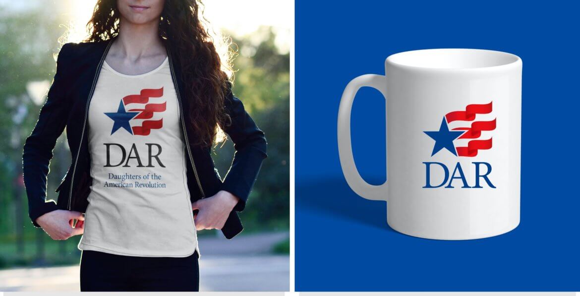
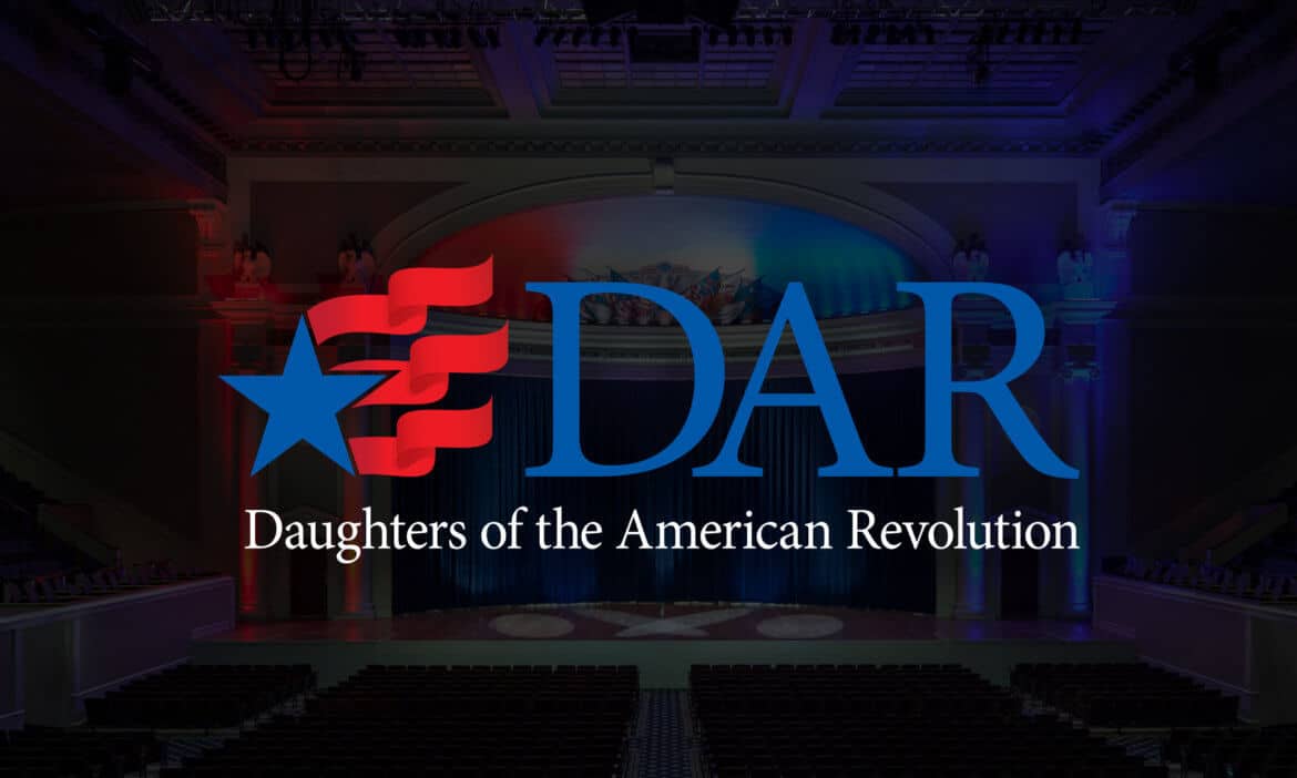
We presented three concept directions: a refined refresh of the existing flag motif, bold new designs built around the American flag, and more radical patriotic concepts. DAR chose the refined refresh. The updated mark, a stylized star and stripes, symbolizes the waving American flag, with three stripes representing the organization's founding principles: historic preservation, education, and patriotism. We paired the new logo with a comprehensive brand standards guide covering usage rules, approved variations, dos and don'ts, and updated mission and vision statements.
The Daughters of the American Revolution is one of the oldest patriotic organizations in the United States, with more than 185,000 members across 3,000+ chapters worldwide. When DAR came to Sutter Group, they were working with a clip art flag logo that had spread unevenly across thousands of chapters, with no formal brand standards to unify them. We helped them establish their first true brand identity, one that honored their storied history while positioning the organization for the next generation of members. To learn more about how we approach association website design, visit our services page.


Color Palette
#002868
DAR Navy
#BF0A30
Patriot Red
#FFFFFF
White
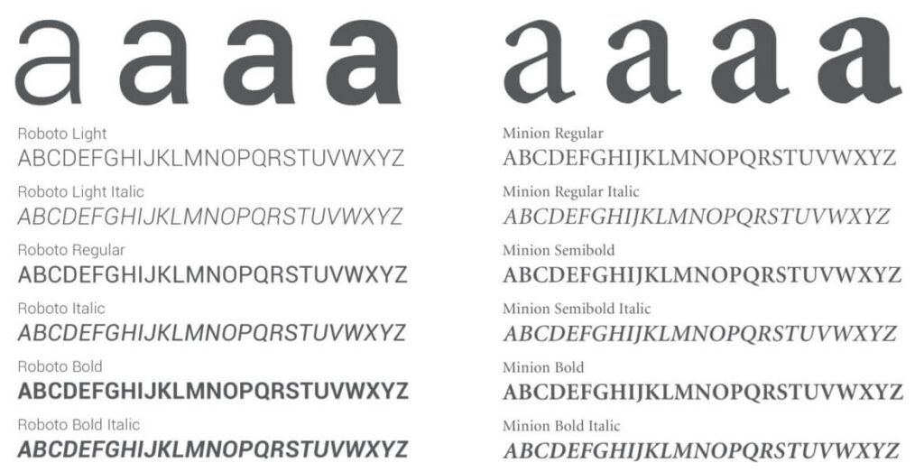
Typefaces
Primary / Sans-Serif
Roboto
Aa Bb Cc Dd Ee Ff Gg Hh Ii Jj
0 1 2 3 4 5 6 7 8 9
Body / Serif
Minion
Aa Bb Cc Dd Ee Ff Gg Hh Ii Jj
0 1 2 3 4 5 6 7 8 9
The Outcome
Chapters Worldwide
Years Since Last Rebrand
Founding Principles