A brand guidelines document goes by many names: brand standards guide, brand bible, style guide, identity manual. Whatever your organization calls it, the purpose is the same: to define how your brand looks, sounds, and behaves so that anyone producing communications on your behalf can do it consistently.
Most organizations know they need one. Fewer know what a good one actually contains or why the difference between a thorough guidelines document and a superficial one matters so much in practice.
Here is what belongs in a brand guidelines document and why each section does meaningful work.
Logo Usage
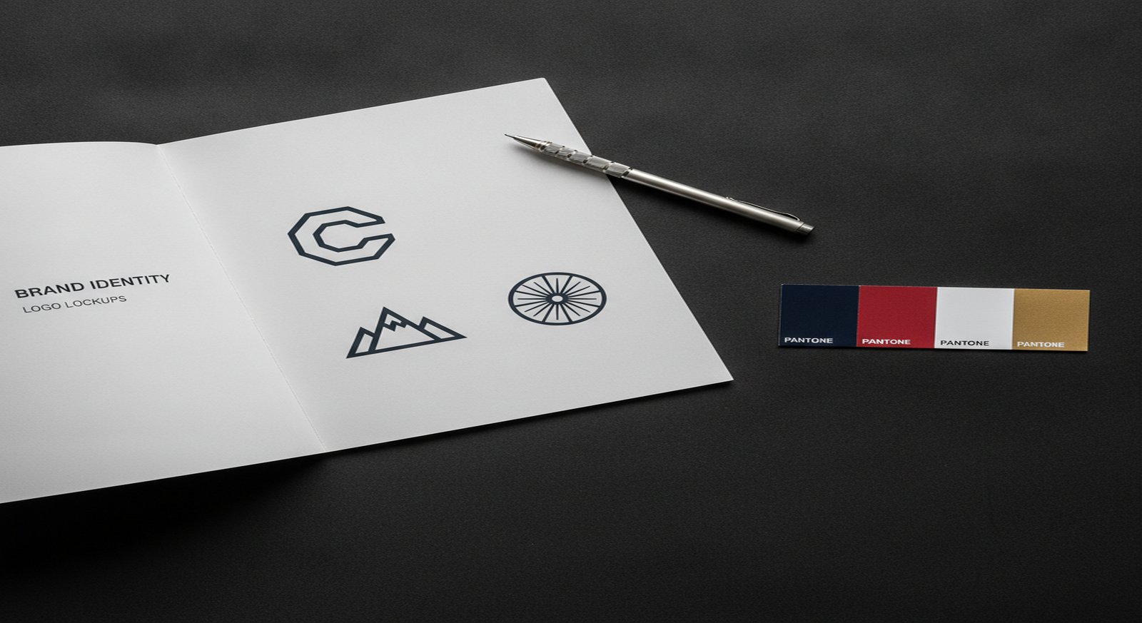
The logo section is the most referenced part of any guidelines document. It should cover the full suite of approved logo variations: the primary lockup, horizontal and stacked versions, icon-only mark, and any tagline variants. Each version needs defined rules for minimum size, clear space (the protected area around the logo), and approved background colors.
Equally important: a clear list of incorrect uses. Show the logo stretched, recolored, rotated, placed on a busy background, and clipped at the edge, with a clear “do not” label on each. This section saves enormous time when working with external vendors, event coordinators, or partner organizations who might otherwise guess.
Color System
Every brand color needs values across all the formats your team will use: HEX for web and digital, RGB for screen applications, CMYK for offset print, and Pantone (PMS) for spot-color and brand merchandise. Providing only one format forces every designer and print vendor to convert values on their own, which introduces drift over time.
The color section should also establish hierarchy: which colors are primary, which are secondary, and which are accent or utility colors. Include guidance on proportional use. A palette is not just a list of colors: it is a system with rules about how those colors relate to each other in practice.
Typography
Define the typeface system in full: the primary display font, body font, and any supporting faces. For each, specify the licensed source (and whether it requires purchase), the approved weights, and the hierarchy rules: what gets set in which face at what weight and size.
Include real examples showing headline, subhead, body copy, captions, and pull quotes in the correct type treatment. Typography guidance without examples is almost always interpreted differently by different designers. Show, do not just tell.
If your brand uses web fonts, include the CSS stack or Google Fonts URL. If you use licensed fonts that cannot be embedded in web pages, document the approved web-safe fallback.
Photography and Imagery Style
Many organizations skip this section and regret it. A brand can have a precisely defined color system and perfect logo usage and still look completely inconsistent because the photography selections vary wildly from one campaign to the next.
A good imagery section defines the subject matter, mood, composition style, and lighting approach that fits the brand. It should include approved examples and counter-examples side by side. “Authentic, documentary-style photography of real staff and clients” means something different than “bright studio photography on white backgrounds with models,” and your guidelines should make that distinction explicit.
Also address illustration and iconography if your brand uses them, and establish whether AI-generated imagery is approved or prohibited.
Voice and Tone
Visual consistency without verbal consistency is only half the job. The voice and tone section defines how the brand speaks: the vocabulary it uses, the sentence structure it favors, the topics it addresses and avoids.
The most useful approach is to define the brand personality in concrete terms and then show how that personality translates to actual copy. “We are direct but not blunt. We are expert but not academic.” is a starting point. A side-by-side example showing the same message written in-voice and out-of-voice is what makes the guidance actionable.
For organizations that communicate across multiple channels and audiences, include guidance on how tone shifts between formal contexts (an annual report, a funding proposal) and informal ones (social media, event signage) while remaining consistent in voice.
Applications and Templates
The applications section shows the brand system at work: letterhead, email signature, business cards, presentation template, social media profile and post formats, signage, and any other formats your organization regularly produces.
For each application, show the approved layout and specify any dimensions, file formats, or production notes relevant to that medium. Where possible, provide editable templates alongside the guidelines. A brand standards guide that describes a business card layout without providing a template will be interpreted differently by every person who designs a card.
How Long Should Brand Guidelines Be?
It depends entirely on the organization. A startup with a clean, minimal identity might have thorough guidelines in twenty pages. A large association or federal agency with a complex identity system across multiple departments, publications, and digital properties might need a two-hundred-page document with chapter-level organization.
The right length is whatever it takes to cover the system completely without padding. Incomplete guidelines create gaps that get filled by guesswork. Over-specified guidelines that try to account for every possible scenario become unwieldy and stop getting used. A well-structured table of contents and a clear visual hierarchy inside the document help make even a lengthy guide navigable.
When to Work With a Designer
If your brand guidelines were created alongside the original identity work, they should already exist in a reasonably complete form. If they were never produced, if they are a single page that covers only the logo, or if they were built years ago and have not kept pace with how the brand has evolved, it is worth investing in a proper update.
The guidelines document is the primary tool that keeps a brand consistent over time and across teams. Organizations that treat it as a living document and update it when the identity evolves get more value from every other piece of communication they produce.
If your organization needs brand guidelines built from scratch or updated to reflect a recent rebrand, we can help. Our work spans associations, government agencies, corporations, and professional services firms.